Button Pushes You
A “call to action,” also known as CTA, is an interface design technique based on “engaging” text labels on widgets to direct users towards a previously defined goal within an application, website, device, etc. (That goal is usually defined by the designers of the system.) Every computer user is probably familiar with buttons labeled in an ambiguous voice, oscillating in between presenting dialog options from the perspective of the user (“I agree to terms and conditions”—the user is talking) and the system offering and suggesting options (“Follow us”—the system is talking).
In most cases buttons labeled in this way can be considered pretty classic interface design: they’re presenting actions a user can activate to change the state of the system according to the user’s mental model. For instance, after pushing “I agree to terms and conditions” the system gained information from the user and will present different options to them; after pushing “Follow us” the system is reconfigured to frequently communicate with the user.1
A few years ago, a new style of button labeling emerged that appears only sightly different, but turns around the whole idea of what a button is. Such buttons are labeled “Get started,” “Explore,” “Launch experience,” etc. and are links to other parts of a system. Pushing them doesn’t change anything in the system’s state, as could be expected from a classic button. Instead, they’re supposed to reconfigure the user’s state. Users have to accept the spelled out mantra and change their attitude before accessing the next piece of information. The work required for this reconfiguration is entirely on the side of the user, the computer doesn’t act as a tool to complete this mini task, the user has to do it on their own.
Below are a few examples screenshotted from random mainstream websites.


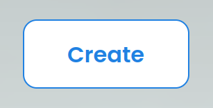
The “Start now” button prompts users to change plans they might have had and “start” right away, instead of maybe next week after completing another project, or on returning from vacation. The “Start doing” button avoids being specific about what should be done and is thereby referring to doing as a value in itself. The user should transform themselves into a “doer,” rather than being considerate, evaluating options, or—lazy, a looser, a mere consumer. The “Create” button welcomes confident “creators.” Before proceeding, users should identify with this new aristocratic class.
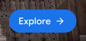
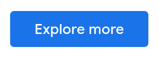
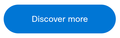
“Explore” buttons usually link to lists of offerings that should ideally be consumed with the user being in an exploratory mood. The “Explore more” button requires that the user already has done some exploring and wants to continue. The “Discover more” button requires that the user already has made at least one discovery and expects to find more. Overall these buttons need the user to have gained a positive impression of the resource they’re currently browsing.
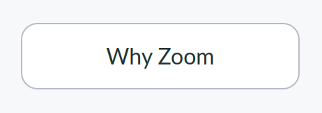
The “Why Zoom” button demands the user to be curious about or have existential questions about the Zoom software.
Navigation and Expression
In this framework, the interface guiding users to resources has developed from classic hyperlinking, to Call To Action, to what I suggest calling “Button Pushes You”:
| Hypertext | CTA | BPY |
|---|---|---|
| index | see images | explore |
| user account | sign up | create |
| manual | get help | learn |
Classic Hypertext link labels use nouns to describe the resource they’re pointing to. A Call To Action (CTA) uses verbs telling the users what they should do, and why. It can be represented by both links and buttons. Button Pushes You (BPY) takes the shape of a button in most cases; the label is short, avoids nouns, and tells the user how to assess the information they’re going to encounter when following the button-shaped link.
Again, BPY at first glance might look like the classic hypertext technique, in which the author of a link creates context with the link label. A classic example would be a link to a policitians site labeled “biggest idiot ever.” However this is clearly the author becoming visible and stating their own opinion. BPY is all about stating the user’s opinion.
The net art piece Kill That Cat by Mouchette (Martine Nedame), 1999, clearly lays out how users that push a button are reconfiguring themselves rather than the system. On the entrance page of the work, a picture of a cat and a button labeled “KILL THAT CAT” quickly move around in the browser window. When the user manages to catch the button with their mouse cursor and push it, they are presented with a guestbook interface in which they have to justify their action of killing the cat. Of course no cat is killed, the button just acts as a link to the guestbook.
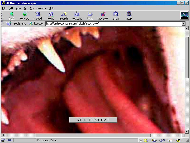
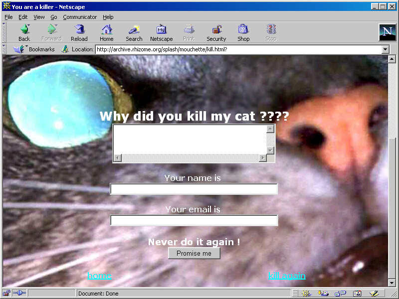
Both screenshots: Mouchette, Kill That Cat, 1999. Screenshot, 2022, Netscape Communicator 4.8 for Windows. As presented in Rhizome’s Net Art Anthology, 2016-12-08.
Button standards
Are buttons different from links, and is that even important? As a foundational element of graphical user interfaces, a button is an surface on a display that through its visual design signals that it can be activated with a pointing device like a mouse, pen, or via touch. A button also serves a communicative role. Activating it is supposed to change the state of an application. For instance, buttons confirm a purchase, mute or enable sound, change the size of a virtual pencil’s tip, and so forth. Human interface guidelines of dominant players in the field show little variation in between them.
Apple defines buttons as elements that immediately change something in an application:
A push button appears within a view and initiates an instantaneous app-specific action, such as printing a document or deleting a file.2
Microsoft’s version reads quite the same, and additionally provides designers with suggestions when hyperlinks would be more appropriate to use than buttons. This might be the best and most precise guideline on buttons in this list.
A button gives the user a way to trigger an immediate action. Some buttons are specialized for particular tasks, such as navigation, repeated actions, or presenting menus.
[…]
Don’t use a Button control when the action is to navigate to another page; instead, use a HyperlinkButton control.3
Google’s “classic” Material Design version 2 component documentation even sounds a bit like an advertisement for what buttons can do:
Buttons allow users to take actions, and make choices, with a single tap.4
The new and updated guide for Material Design 3, which will probably soon replace previous versions, already points towards a shift for the role of buttons. The description skips foundational statements and jumps right into declaring that
Material Design includes nine types of buttons.
Then it goes to great lengths sorting them by “level of emphasis”:
A button’s level of emphasis helps determine its appearance, typography, and placement.5
The importance of a button, as decided by the designer of a system using Material Design, is the only determining factor for its visual appearance. The supposedly least important buttons, called “Text Buttons,” don’t have an outline or elevated appearance; they’re just text in different color, in other words, they look exactly like hyperlinks. The idea is that the more visual features of a classic button a Material Design button exposes—outline, distinct background color, elevated apprarance—the more likely a user is to “tap.”
Material Design 3 buttons sorted from highest emphasis (1) to lowest emphasis (5). Cropped image copied 2022-06-04 from All buttons from Google’s Material Design 3 documentation.
This means that Material Design 3 acknowledges that an element that looks like a button communicates something different than an element that looks like a hyperlink. If nothing else, the level of activity and manipulation is understood to be higher when more button signifiers are present. Yet Google’s guidelines choose to not use this for communicating choices and functions or non-functions to users. Instead, they’re nudging users to follow links by pushing buttons, so they reconfigure themselves to think that they changed something.
As Material Design 3 has formalized BPY, it has to be expected that these types of buttons will become an accepted standard for all kinds of user interfaces, and designers will strive to name and strcuture products and activities accordingly. BPY represents a shift to turning user interfaces into a decision theatre that, by redefining long established elements, tricks users into performing work for the system they’re using.
(This article is based on a thread on post.lurk.org.)
“The control type that corresponds to a verb is called the imperative control because it commands immediate […] Click the button and the associated action—the verb—executes immediately.”
Alan Cooper, Robert Reimann, and Dave Cronin. About Face 3: The Essentials of Interaction Design. Wiley Publishing, Indianapolis. 2007. p.440 ↩︎
From Apple’s Human Interface Guidelines on macOS Push Buttons, last modified 2022-03-02 ↩︎
From Microsoft’s Windows 11 desktop app developer documentation about Buttons, last modified 2022-05-13 ↩︎
From Button as defined for Google’s UI frameowrk “Material Design,” no last modified information available, accessed 2022-05-14. ↩︎
See All buttons from Google’s Material Design 3 documentation, no last modified information available, accessed 2022-05-14. ↩︎