The Mastodon Mobile App & Content Warnings
The social networking software Mastodon1 supports content warnings:
When a content warning is included, the status content will be collapsed by default, and only the CW will be shown, similarly to an email subject line or a “read more” break. This can be used to add a summary or subject for your post, to collapse long posts, or to otherwise provide context or setup for the body of the post.2
A post with a content warning manifests in users’ timelines as the text given as content warning and a “show more” button. The full post is displayed when the button is activated by the reader.
On Mastodon content warnings are used in many different ways: to spare others from reading spoilers, when users feel that their post is maybe too long, nerdy, or rambly and would rather have others to opt-in to reading, for leading up to a joke’s punchline, and so forth. There is also more serious applications of the feature, in which users give hints that their post could be potentially harmful to others or too personal, such as discussing physical or mental health issues, drug use, etc.3 It seems fair to say that content warnings are one of Mastodon’s distinctive features, and have been adopted and greatly valued by its userbase.
The following screenshots show how these content warnings are displayed on the Mastodon web interface, and in the popular, independently developed mobile app Tusky:
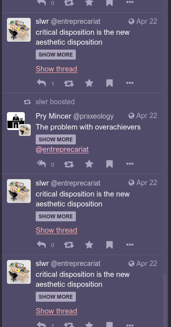
A timeline with posts using content warning on the Mastodon web interface.4
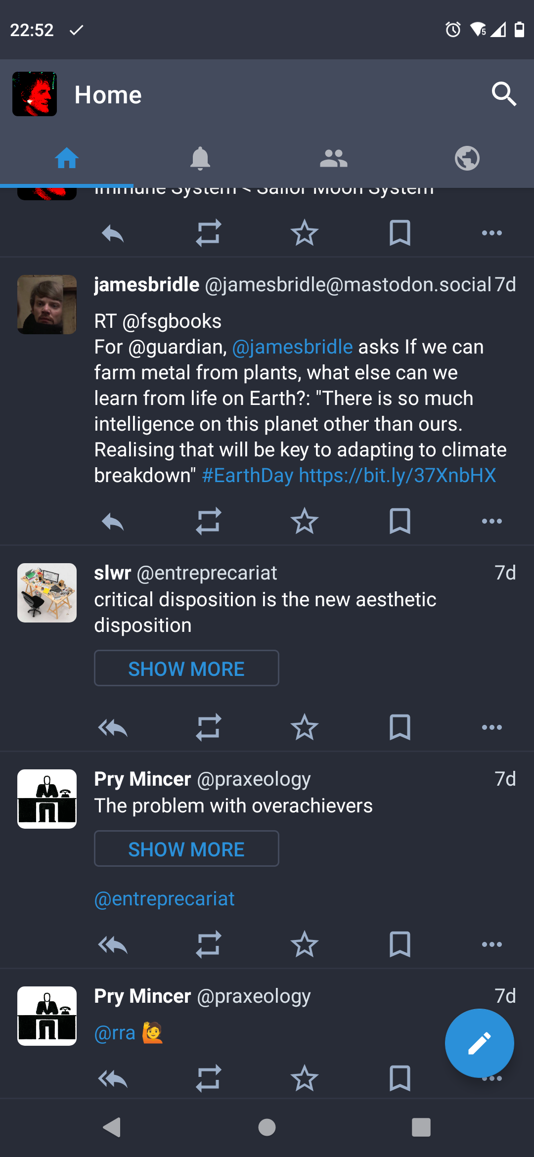
A timeline with the same posts on Tusky.
The posts with content warnings fit nicely into the timeline display and allow to scroll by easily if there is no desire to read the full post.
On 2022-04-21, the Mastodon project announced the availability of an official Mastodon mobile app, partly supported by the Prototype Fund, with design by Lickability.
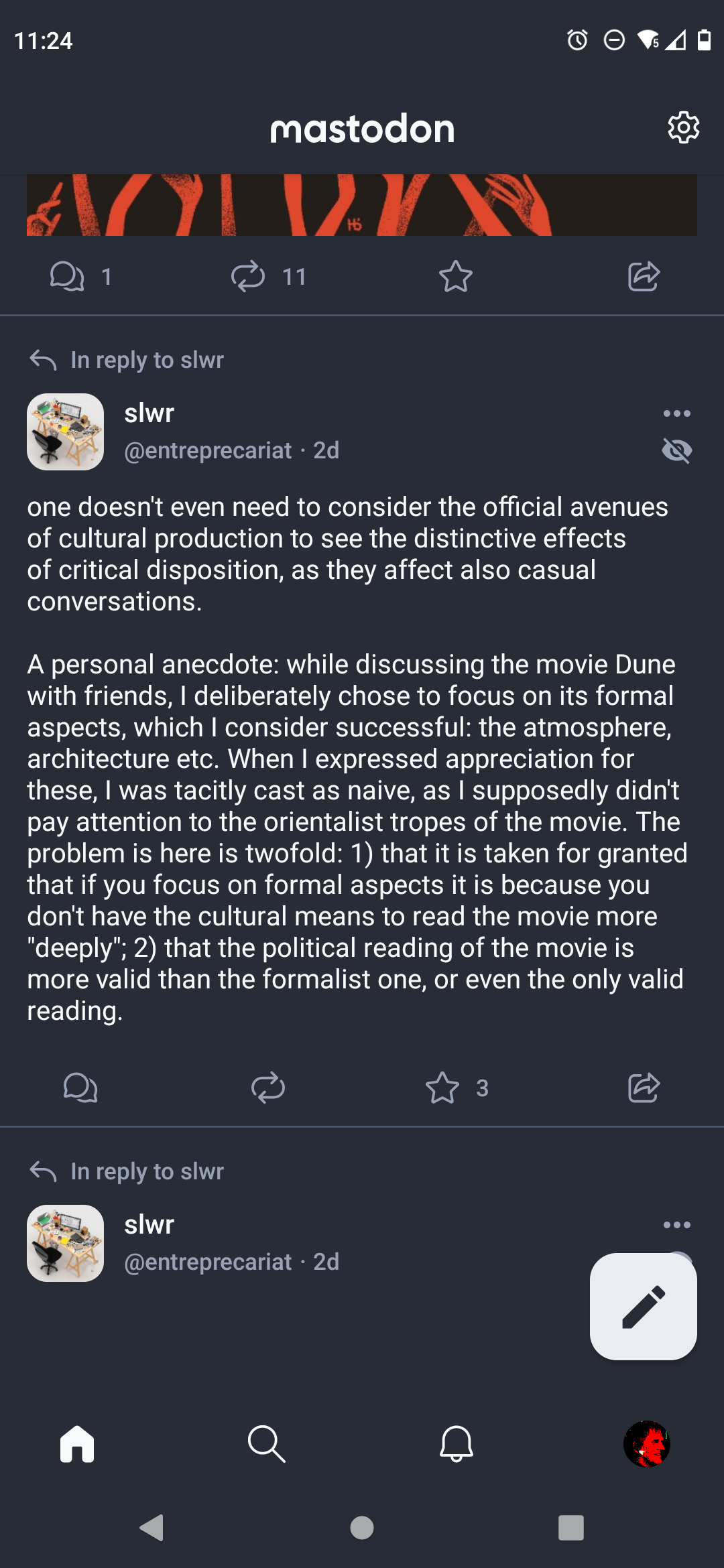
The app is undeniably more elegant looking than other efforts such as Tusky, but has implemented content warnings in a completely different manner, see screenshots below:

The post containing a content-warning before revealing the content…
…and after revealing the content.
Posts with content warnings appear highlighted, like a headline, with the content warning text centered in larger type. Below the content warning, a label prompts the user to “Tap to reveal.” Each post in its “unrevealed” state takes up as much space as if the post’s contents were already displayed, creating large gaps in the timeline, hinting towards something is missing here.
With the more serious applications of the content warning feature, this can easily lead to tasteless, sensationalist looking situations. Below is a screenshot of a post created to illustrate the case:
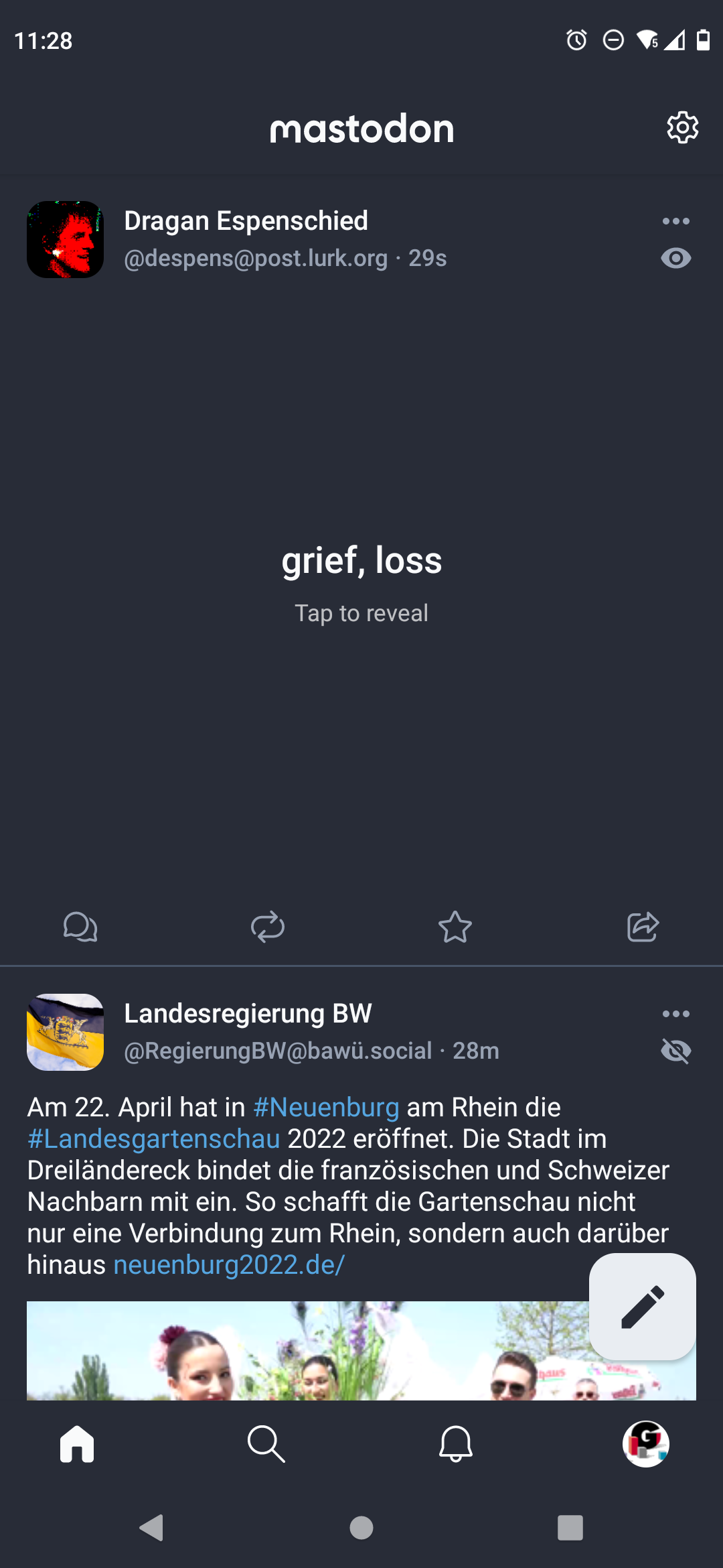
The Mastodon mobile app is displaying the content warning “grief, loss” like a banner that needs to be activated.
The content warning handling in the Mastodon mobile app can be read like the tone-deafness of some of the most criticized features of facebook, Google Buzz, etc. that were assuming a certain capitalist culture of self-image, self-marketing, and sharing.
It is unliekly that the Mastodon project subscribes to these world views—it has been specifically created to offer an alternative to corporate-owned social media and in August 2021 became a non-profit organization—yet the design processes that created this elegant app are the same as in corporate software, and are sure to fail outside of that frame. Increasingly these design processes seem to be the only ones available:
- When designing social software, the focus tends to be on situations in which users are having a good time together, share fun stuff, and behave nice and respectfully. The goal of creating a pleasant environment is conflated with a design that assumes this utopian situation has already arrived and is shared and internalized by all users. The Mastodon mobile app’s content warning feature was designed for sharing jokes and spoilers, not for giving actual content warnings.
- Clear interactions and elegant animation is prioritized over accounting for complicated, messy, real-world use. On the Mastodon web interface, expanding a post pushes all posts below it downwards, shifting elements around rather abruptly. In contrast, the mobile app already reserves space for the hidden content to be shown, which makes the timeline appear visually more stable and solid; at the expense of content warnings looking like banners, and increasing the surface for accidentally activating the full post.
- The label “Tap to reveal” is formulated as if to drive engagement with the post. In contrast to the neutrally labeled “show more” button, it is not a description of what actions a user interface element will perform, but suggests that something is hidden behind a veal and has to be revealed. Additionally, the lack of Gestalt in the user interface (read as “simplicity,” a supposedly desirable quality) mandates the use of whitespace and extended text copy. Even if to keep the wording, a button labeled “reveal” would have been enough, because the button already communicates that it can be “tapped.” If an interface element instead takes the role of a “call to action” that should drive engagement, it needs to explicitly tell users what to do and why, how satisfying this engagement will be, with as many verbs as possible.
(This article is based on a thread on post.lurk.org.)
Mastodon is an open source project that implements a distributed social network on top of the ActivityPub protocol. It looks and works similar to Twitter. Multiple forks, front ends, and mobile apps do exist that allow access to the Mastodon network, all of them have based their design closely on the original Mastodon. ↩︎
Quoted from the Mastodon user guide section Content warnings and sensitive content. It uses the terms “status,” “toot,” and “post” interchangeably to mean a single message users publish on Mastodon. (This article uses “post.”) ↩︎
The “Fediverse Guide” lists some common abbreviations used in content warnings. ↩︎
The particular content warning “critical disposition is the new aesthetic disposition” hides a thread with quite long posts that diving deeply into activist academic language. ↩︎